js13k 2023 Postmortem
Quick links #
Another year, another js13k!
Before diving into the details, here's some useful links:
- You can play the submitted version of this game at https://js13kgames.com/entries/harold-is-heavy
- I also host the most recent version at https://harold-is-heavy.7tonshark.com
- The source code is available on GitHub at https://github.com/elliot-nelson/js13k-2023-harold-is-heavy
And here are the tools used:
- Code written using VSCode
- Build pipeline includes gulp, rollup, and roadroller
- Artwork created using Aseprite
- Map created using Tiled
- Sound effects generated with zzfx
- Music created using Sound Box
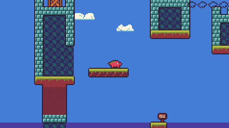
The Checklist #
As with every year, I didn't know the what the theme would be until the competition began, but I had a list of things I was hoping to accomplish:
- Every game I've made so far has been some kind of top-down or strategy game - I've never made a platformer / side-scroller, so that would be fun.
- I tend to gravitate towards sinister themes: dark, muddy graphics, brooding soundtrack, horror, etc. So I thought it would be fun to go way over the top in the other direction and see what I could do with a colorful palette and happy music.
- In past years, I've always found my ideas way too ambitious once I'm actually coding them, and I end up implementing 10% of the game I had in my head. This year, I wanted to make a game SO simple, that I could spend at least half the time just polishing it, instead of so much time cramming it in to fit.
- It would be fun to make a game about an animal (like a fox, or a squirrel), rather than a human.
You put these goals together and you've got: a fun, colorful platformer, that's really simple, and highly polished, where you play as an animal. Easy!
The visuals #
I had a great time last year building within a specific palette, so I decided to do it again this year.
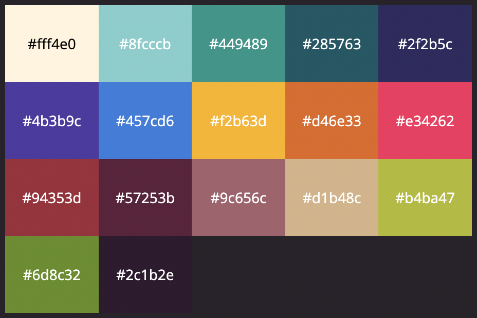
I experimented with a large number of 16-color palettes, but eventually settled on Indecision by Nelson SMG - the off-white and off-black and bright, flat colors seemed perfect for this project.
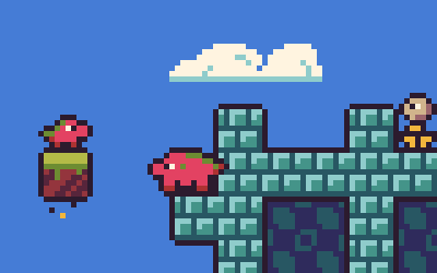
Originally, "Harold" was going to be a fat fox (using the orange and yellow colors), but my attempts at drawing a fox all turned out looking like pigs. So I decided Harold would be a pig, using the bright pink color. Eventually, based on some timely suggestions from folks on the js13k slack channel, Harold became a baby dragon - same pig sprite, just a little bit of extra dark green.
Given the theme, I wanted some interior "castle" areas to get that 13th century feel. The palette had no real gray or stone colors, which forced me to experiment with tans, browns, blues, etc. I was already using the greens for grass and the browns for dirt, so I ended up using some of the brighter blues for stonework. Although I wasn't sure at first, I ended up feeling like those bright blue castle walls are a big part of the fun look of the game.
Similarly, when it came time to make enemies, I needed some way to distinguish them. I ended up setting aside the bright yellow and tan colors I wasn't using yet to represent the enemies.
Like last year, I chose a game size of 240x135 pixels (1/8 of 1920x1080 aspect ratio), to get a nice chunky pixel art feel.
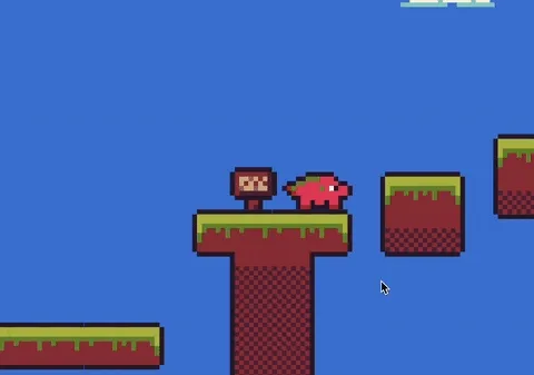
To get Harold's particular "outlined" look, I used a couple techniques. For the moving sprites, I drew the outline into the sprite, ensuring the outer edges were always the black color. For tiles, which are 8x8 pixels in this game, I had another 10x10 "outline" tile. So first, I draw the sky color; then I draw any background tiles (i.e. castle interior); then I draw the 10x10 outline tile around every tile that isn't passable by the player; then I draw the actual tiles. The bounding box of each moving sprite is designed so that when they are standing on the floor, their bottom outline merges with the top outline of the tile they are standing on, and voila! It adds a little bit of extra cartoony/comic-book feel to the visuals (and helps everything stand out).
The music #
I used Sound Box to compose the music this year, flailing around with some chords and additional notes until it sounded "good enough". Technically the chords in the music are in Dorian mode, which is usually more for a melancholy or sad sound than a happy/bright sound, but by the time I realized this I didn't have time to keep experimenting with it. (In the future I might intentionally go for Lydian mode and see how it sounds.)
If you want to play around with the song, you can open it in SoundBox using this direct link.
A tip I learned from past years: when saving your music, always save the binary version and keep a copy in your project, as you can drag and drop it back into Sound Box later to continue editing it. The JavaScript export is not as easy to reopen.
The physics #
Because all of my past games have been top-down, I'd never actually written the classic this.vel.y += GRAVITY type of physics, at least for a JS13k game. I initially was struggling a lot with making the movement and jumping in the game feel remotely satisfying. There are many guides online on how to properly set up your velocity and gravity constants, but the one that ended up helping me the most was a talk called Math for Game Programmers: Building A Better Jump. Once I knew how fast I wanted Harold to walk, and about how high and far he should jump, the rest came easy.
While fine-tuning the jumping, I came upon a nice summary of Platforming Tips and Tricks, with a whole checklist of ways to improve player jumping. I experimented with many of these and even implemented some of them (in particular, Catch Missed Jumps and Jump Buffering). Some of the others, like Early Fall and Variable Jump Height, just didn't interact well with the look I wanted: Harold is Heavy, so he should fall hard and fast, with a "thud", not be floating around or precision-controlling his jumps. (With more time there are additional tricks, like Coyote Time, that I would include, but with little time to spare I didn't want to risk introducing new bugs.)
For collision detection and handling, I ended up having to throw out all of my previous year's work related to colliding objects because it was based on circles and pathfiding around objects and such, and it was producing all kinds of unwanted behavior (like sliding off edges of platforms). I ended up replacing all my physics with much simpler AABB checks, for colliding with tiles and other entities. My version has a lot of rough edges and a few specific bugs, but it mostly does the job for the relatively similar player and enemy sizes in the game. (If I introduced larger enemies, like bosses, I'd need to fix up some of these underlying issues to make sure they interacted correctly with Harold and the environment.)
Polishing the jumps #
In this game, you can move left and right, and you can jump. Because the player only has one button that they can press, I wanted pressing that button to be really satisfying. A jump sound effect whenever you take off, the little dirt particles that scatter when you land, the small screenshake that happens every time Harold falls onto something (maybe overkill!), it's all designed to make jumping fun.
The effect I'm most proud of is the landing "tile bounce" -- when Harold lands on the ground, the tile section immediately below him drops 2 pixels, and then gradually moves back up again. When this animation is happening, although Harold's actual Y value is at the normal tile height, he is rendered as if he was standing on the tile -- this really sells the idea that it is Harold's weight that pushes down any platform he lands on. Any other entities, like signs, enemies, and boxes that are on the same platform don't move, which in-game gives the effect that Harold lands so hard he "bounces" everything near him slightly. (Again, thanks to all the great ideas from folks on the js13k slack channels!)
For a while, I was playing around with having the camera "float" -- following Harold from a distance and allowing the player's sprite to be somewhere near the center of the screen, but not always dead-center. I never could get this quite right, however; the camera movement often negatively interacted with the look of the jump, or the screen shakes, or the platform movement, ending up making it seem like things I wanted to move weren't moving.
In the end, I removed all the floaty camera work and just fixed the center of the screen on Harold. The only time the camera is allowed to "move off" Harold is when you're near the bottom of the defined level -- in this case, the camera stops just above the bottommost tile, which allows me to have a "Harold falls off the bottom of the level" effect if you miss a platform.
Teaching the player #
I spent a lot of time thinking about how to make playing the game completely obvious -- do you have a tutorial level? Do you put all of the instructions on the screen during your loading screen? Do you tell players how to do something first, or let them fail and then tell them how to do it?
I ended up with the following guidelines:
-
Every new challenge that can kill Harold will always be at the very beginning of a level. If you fall off a platform in level 1, or try to run into a Knight on level 2, or jump on a Hedgehog in level 3, you respawn only steps away from where you died -- the player can immediately try something different.
-
Let the player interact with the challenge first, and possibly succeed, then instruct them (either to confirm what they learned, or correct them if they learned the wrong lesson). For example, the player may naturally jump on the Knights in level 2, but in case they jumped over them, we'll tell them that Harold can squash enemies. On level 3, the player may have thought Hedgehogs are just invulnerable, so after you get past your first one, we'll give them a little additional instruction.
-
This rule has to be broken if the player will just be "stuck" -- so on level 1 I make sure the first signs tell you how to move, and on level 3 I kind of hedge my bets (the player might try to squeeze through the 1-high gap, or might immediately climb up to the sign, but either way they will know what to do next).
The signs ended up being a nice trade-off here. Unlike a "tutorial pop-up", a player can choose to run past a sign; but, it also gives players the freedom to go back and re-read the information again if they missed it. A sign is also an object in a level, so when the player sees a sign, they know that additional information is coming.
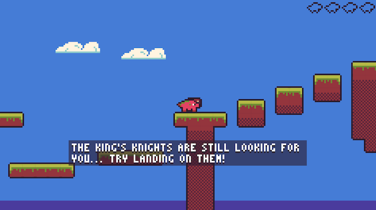
Back in 2020, I used the tutorial pop-up approach in WIZARD WITH A SHOTGUN. Now that I've tried both, I think the player experience with signs is way better, so I'll be looking for ways to incorporate a similar experience in future entries!
Finishing touches #
One of my initial goals was to take a simple idea and just polish, polish, polish it, and see what I could come up with. So I put a litle extra effort this year into things like:
- An intro screen (really just an excuse to get the player to tap a key, so I can initialize the browser's audio)
- A loading screen (really just a way to hide building up the music buffer for the Sound Box player)
- The victory screen (with two last-minute additions: a "score", to add some potential replayability, and a replay of the last level the player saw using the player's own recorded inputs, which I thought was a cool addition)
In the last couple days of the gamejam, I also started experimenting with between-screen "transitions", but they were a bit buggy and I didn't want to risk introducing visual bugs so late. But I think that might be something I experiment more with next year (some nice, tweened, screen slide / fade / wipe effects could definitely add some polish to any game).
Conclusion #
Overall, I feel like the jam was a huge success for me this year. Harold is Heavy is short, doesn't have a ton of replayability, and (even if you added more levels and more enemy types), I don't think you could extend it beyond maybe 10 levels of real fun. But it is, by far, the most polished and complete game I've made, which was my goal going into this year -- and it's given me plenty of ideas for new things to try in the future.
Thanks all for playing and reading, and see you next year!
- Previous: Handling generated code in Rush
- Next: Yet Another Redesign