js13k 2022 Postmortem
This year, up until the theme announcement, I was unsure what game I was going to build, but I did have some specific goals:
- I wanted to support mobile/tablet for the first time (my previous games were desktop only).
- I wanted to experiment with low-resolution, limited-palette graphics.
- I wanted to make a game with more "user interface" -- more like an RTS or Tower Defense game and less like a traditional "gamepad" genre (like scrollers, dungeon crawlers, and shooters).
Let's see how it went!
Quick links #
Before diving into the details, here's some useful links:
- You can play the submitted version of this game at https://js13kgames.com/entries/moth
- I also host the most recent version at https://moth.7tonshark.com
- The source code is available on GitHub at https://github.com/elliot-nelson/js13k-2022-moth
And here's the tools used while building this game:
- Code written using VSCode
- Build pipeline includes gulp, rollup, and roadroller
- Artwork created using Aseprite
- Map created using Tiled
- Sound effects generated with zzfx
- Music created using SoundBox
The graphics #
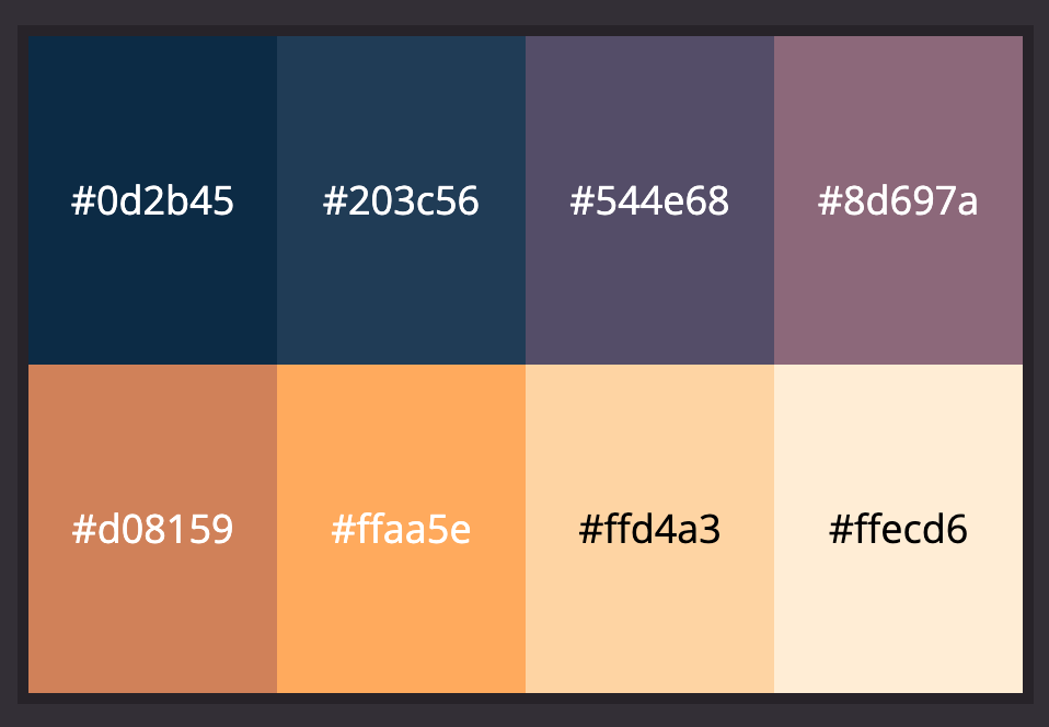
After browsing through palettes on Lospec for inspiration, I found an 8-color palette called SLSO8 by Luis Miguel Maldonaldo that had the perfect aesthetic.

This kind of color scheme is called a monoramp: it's not monochromatic (because it can shift through different hues), but it consists of a single ramp from low to high brightness. I paired this palette with a game resolution of 240x135 pixels (not quite as low as the original Gameboy's 160x144 pixels, but it was as close as I could get and still have room for legible text).
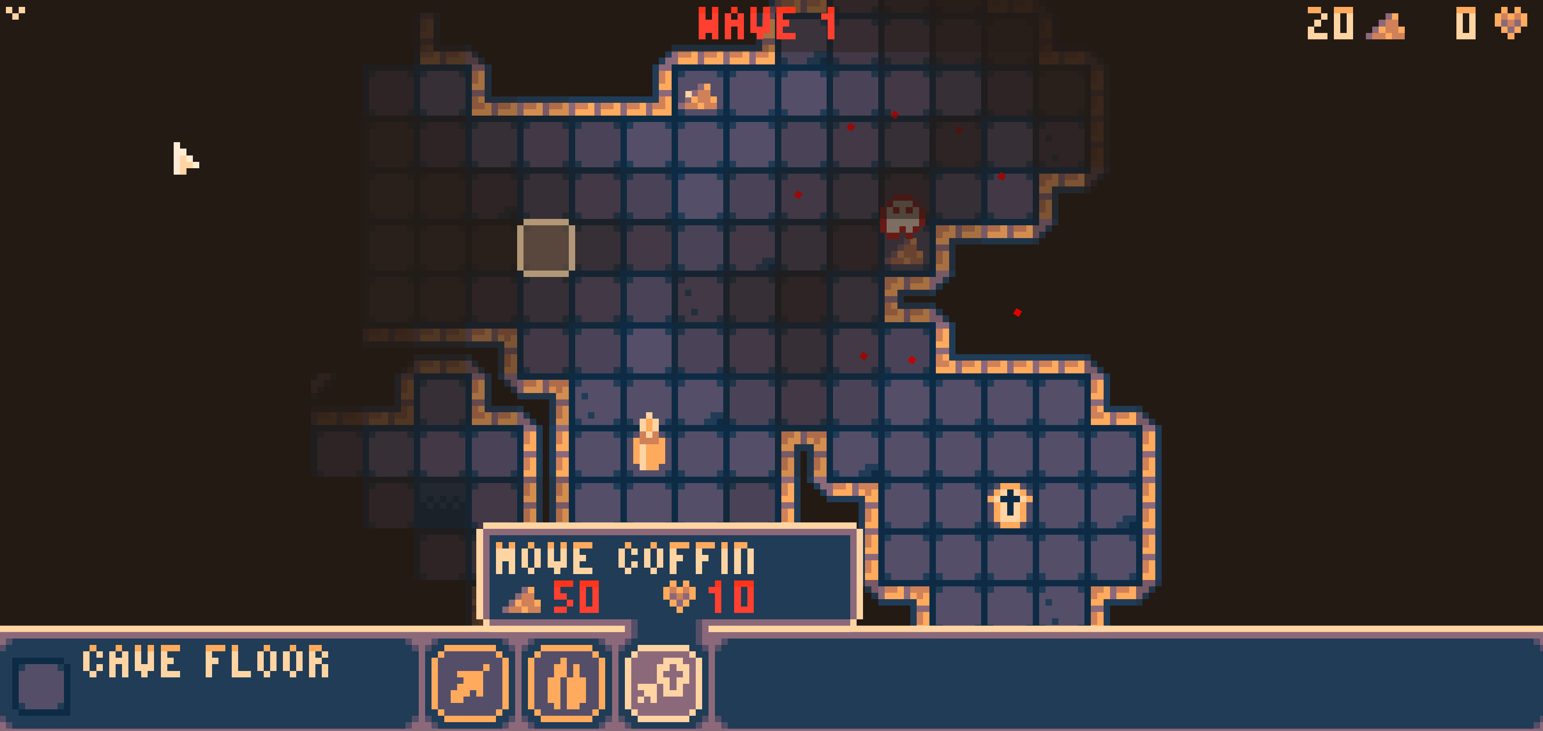
In the end I had to cheat a little bit on the original 8 colors. To help enemy attacks stand out and highlight actions you couldn't afford, I added a shade of bright red. I also added another dark shade of brown to act as the map background: the existing blues were perfect for shadows, but they are cold colors, and I wanted the background to be a warm color to match the rest of the palette.

On-screen there are many more colors than just 8, since I use several shades of opacity to mimic "lighting" (the further away from moths or buildings you are, the darker it gets, with unexplored areas being totally dark). So these colors are just my goalposts, and not a strict "3-bit" technical limitation.
Tiles #
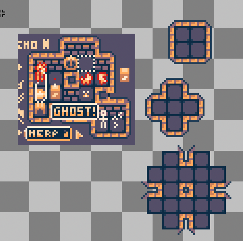
As I began experimenting with the palette in Aseprite, I originally wanted to do 2.5D walls. I still think this is possible, although I ran out of time to get it right this year, and went back to just a top-down view for the walls. Here you can see some early 2.5D doodling on the left, while on the right I've chosen top-down walls and have laid out a bunch of possible wall configurations.

This is a classic tiling dilemma -- once you add up the different walls, inner corners, outer corners, 3-way corners, walls with opposite outer edges, etc. you have a huge number of individual tiles. This causes two problems: one, it takes forever to draw your map, because you are spending all your time picking the exact right tile out of your list of 40+ tiles. Two, it eats up a bunch of your 13 kilobytes, as a lot of your spritesheet is nearly-identical versions of your walls.
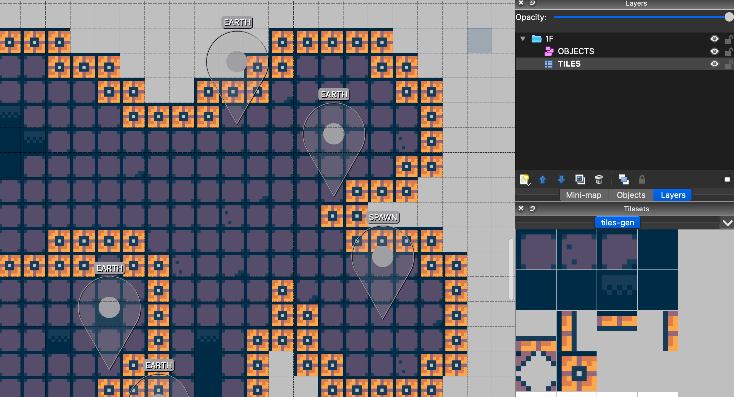
To handle this issue, I made sure that my tiles consistently lined up no matter what configuration they were in (as in the picture above), and I consolidated down to just 4 walls and 2 "corner" tiles. At runtime, I cut out pieces of those tiles to build all of the 40+ tile variations that you can run into in the game, but while editing my map I just use a single wall (the blockiest one, "inner corner", as shown below in Tiled).

(In hindsight, I could have consolidated left/right and top/down walls walls as well, for a total of 4 wall tiles.)
To achieve this effect at runtime, you need to do two things: first you need a way to evaluate the floor tiles around you so you know what types of walls you need; then, you need to actually draw those walls correctly out of your consolidated tiles.
Here's my version of the first part:
makePrettyWalls() {
    for (let r = 0; r < this.tiles.length; r++) {
        for (let q = 0; q < this.tiles[0].length; q++) {
            if (this.tiles[r][q] === TILE_CORNER_INNER) {
                let bitmask = 0;

                if ((this.tiles[r - 1]?.[q - 1] || 99) < 8) bitmask |= 0b100_000_000;
                if ((this.tiles[r - 1]?.[q] || 99) < 8)     bitmask |= 0b010_000_000;
                if ((this.tiles[r - 1]?.[q + 1] || 99) < 8) bitmask |= 0b001_000_000;
                if ((this.tiles[r]?.[q - 1] || 99) < 8)     bitmask |= 0b000_100_000;
                if ((this.tiles[r]?.[q + 1] || 99) < 8)     bitmask |= 0b000_001_000;
                if ((this.tiles[r + 1]?.[q - 1] || 99) < 8) bitmask |= 0b000_000_100;
                if ((this.tiles[r + 1]?.[q] || 99) < 8)     bitmask |= 0b000_000_010;
                if ((this.tiles[r + 1]?.[q + 1] || 99) < 8) bitmask |= 0b000_000_001;

                Sprite.getDynamicTile(bitmask);
                this.tiles[r][q] = TILE_DYNAMIC + bitmask;
            }
        }
    }
}
I don't have any doors or moving tiles in this game, which means I can evaluate the entire map just once, converting each wall into a new "bitmasked" wall that describes exactly what wall to display. The bitmask is 9 bits, where the first (most significant) 3 bits represent whether there are floors in the upper-left corner, directly above, and upper-right corner, and so on down to the last (least significant) bit, which represents whether there is a floor in the lower-right corner.
The bitmask tells us where the floors are in relation to this wall, but we still need to turn that into a pretty tile. That happens next:
getDynamicTile(bitmask) {
    if (!this.tiles[bitmask + TILE_DYNAMIC - 1]) {
        this.tiles[bitmask + TILE_DYNAMIC - 1] = initDynamicSprite(createDynamicTile(this.tiles, bitmask), { x: 0, y: 0 });
    }

    return this.tiles[bitmask + TILE_DYNAMIC - 1];
}

createDynamicTile(tiles, bitmask) {
    let canvas = createCanvas(TILE_SIZE, TILE_SIZE);

    // First, we render outer corners

    if (bitmask & 0b100_000_000) {
        canvas.ctx.drawImage(tiles[TILE_CORNER_OUTER - 1].img, 0, 0, 4, 4, 0, 0, 4, 4);
    }
    if (bitmask & 0b001_000_000) {
        canvas.ctx.drawImage(tiles[TILE_CORNER_OUTER - 1].img, 5, 0, 3, 3, 5, 0, 3, 3);
    }
    if (bitmask & 0b000_000_001) {
        canvas.ctx.drawImage(tiles[TILE_CORNER_OUTER - 1].img, 6, 6, 2, 2, 6, 6, 2, 2);
    }
    if (bitmask & 0b000_000_100) {
        canvas.ctx.drawImage(tiles[TILE_CORNER_OUTER - 1].img, 0, 5, 3, 3, 0, 5, 3, 3);
    }

    // Next we render standard walls (potentially overwriting outer corners above)

    if (bitmask & 0b000_001_000) {
        canvas.ctx.drawImage(tiles[TILE_WALL_LEFT - 1].img, 5, 0, 3, 8, 5, 0, 3, 8);
    }
    if (bitmask & 0b000_100_000) {
        canvas.ctx.drawImage(tiles[TILE_WALL_RIGHT - 1].img, 0, 0, 4, 8, 0, 0, 4, 8);
    }
    if (bitmask & 0b000_000_010) {
        canvas.ctx.drawImage(tiles[TILE_WALL_TOP - 1].img, 0, 5, 8, 3, 0, 5, 8, 3);
    }
    if (bitmask & 0b010_000_000) {
        canvas.ctx.drawImage(tiles[TILE_WALL_BOTTOM - 1].img, 0, 0, 8, 4, 0, 0, 8, 4);
    }

    // Next we render inner corners (potentially overwriting parts of walls above)

    if ((bitmask & 0b010_100_000) === 0b010_100_000) {
        canvas.ctx.drawImage(tiles[TILE_CORNER_INNER - 1].img, 0, 0, 5, 5, 0, 0, 5, 5);
    }
    if ((bitmask & 0b010_001_000) === 0b010_001_000) {
        canvas.ctx.drawImage(tiles[TILE_CORNER_INNER - 1].img, 4, 0, 4, 4, 4, 0, 4, 4);
    }
    if ((bitmask & 0b000_001_010) === 0b000_001_010) {
        canvas.ctx.drawImage(tiles[TILE_CORNER_INNER - 1].img, 4, 4, 4, 4, 4, 4, 4, 4);
    }
    if ((bitmask & 0b000_100_010) === 0b000_100_010) {
        canvas.ctx.drawImage(tiles[TILE_CORNER_INNER - 1].img, 0, 4, 5, 4, 0, 4, 5, 4);
    }

    return canvas.canvas;
}
Rendering everything in layers this way helps us avoid a lot of logic like "if it has a floor on left but not a floor in upper-left", etc. -- we start by drawing any outer corners based on the bitmask corners, but those outer corners will be covered up if there's a floor directly to the top/left/right/bottom of us. If there's a floor to the top and right of us, we'll draw both a top and a right wall (which will look ugly), but we'll finish by drawing an upper-right corner, which seamlessly connects the two. Finally, we wrap the whole thing in a tile cache so we don't render the same bitmask twice (anything we've already generated, we can reuse). Cool!
User interface #
Designing the user interface for this game was by far the hardest part, mostly because I kept running into issues I had not solved in game development before. For example: you tap on the screen, what happens? If it's on a valid tile, you can select it; but if we're drawing the bottom tray over that tile, you should select whatever is in the tray instead; if you are over an action button in the tray, you should select the action button, etc.
I quickly realized I needed to put some kind of structure around this process. My minimal version of this was to implement a tap() function on a whole bunch of "user interface elements", letting them call each other. In the final version, here's the tap() function for Game, my top-level object:
tap(uv) {
    for (let ui of [Hud, World]) {
        if (ui.tap(uv)) break;
    }
}
So here I try to tap() the Hud first; if it returns true, that means Hud handled the tap, and World doesn't get to respond. If Hud returns false, then World gets to try, and so on. If nobody responds, then nothing happens.
Here's what Hud's tap() looks like:
tap(uv) {
    if (uv.v > Viewport.height - TRAY_HEIGHT) {
        for (let i = 0; i < this.actions.length; i++) {
            let uvAction = this.uvTrayAction(i);
            if (uv.u >= uvAction.u && uv.u <= uvAction.u + 12 && uv.v >= uvAction.v && uv.v <= uvAction.v + 12) {
                if (this.actions[i] === this.selectedAction) {
                    if (this.selectedAction.tap()) {
                        this.selectedAction = undefined;
                    }
                } else {
                    this.selectedAction = this.actions[i];
                }
                return true;
            }
        }

        this.selectedAction = undefined;
        return true;
    }

    this.selectedAction = undefined;
    return false;
}
Now it's more complicated... I'm using (u,v) here to represent on-screen coordinates, so if the v coordinate is not low enough, we automatically return false (because we aren't over the tray). If we are over the tray, we need to check any actions that are currently being displayed; if you tap nothing, we have to deselect the current action; if you tap something, we need to select it; if you tap something already selected, then it needs to actually perform that action, which we do by calling tap() on the action itself, and so on.
It turns out, designing a user interface that works the way a player expects it to work requires a surprising amount of code!
Gameplay #
The way I envisioned the moths in this game is sort of like worker units in a game of StarCraft... helpless on their own, but also critical, because they are the only way to expand your sphere of influence (in this game, they are also the only way to explore, since there aren't any other mobile units).
Deciding how to control them, however, proved to be a challenge. If a moth is just idling, and you double-tap on a square, that's the one that will go exploring. If you want all of your moths to run somewhere, you can keep tapping any square repeatedly to collect them all up. But there's definitely some grey areas -- there's situations where you tap something and the only moth nearby sits there and a moth from the opposite end of the game tries to go there instead, potentially getting itself killed by ghosts. That's not good!
Overall I ended up liking the feeling of these worker units, they are a little bit flighty and unpredictable and are not strictly RTS (you can't select exactly 3 of them and move them around like in StarCraft). However, I think the game needed to do a better job of explaining how they work, and if it's not going to allow microcontrol of every unit, it needs to be better at guessing what the reasonable player would expect (like selecting the only moth they can see on the screen at that moment, for example).
Lessons learned #
After showing the game to friends and family, the biggest takeaway by far was that people weren't sure what to do.
In contrast, my game from last year (WIZARD WITH A SHOTGUN) included an in-game tutorial explaining how to move, how to shoot, how to reload, etc. So my big takeway for next year is to include some kind of in-game tutorial or instruction page, so you aren't frustrating players right off the bat with unclear gameplay.
Another adjustment I would make is to improve controls for mouse users. I intentionally designed this game as a "tap first" experience, to make sure it remained playable on mobile and tablet, but it ended up feeling stilted a bit on desktop. For example, I'd probably choose to give mouse users "hover" over action buttons, and have one click perform the action instead of requiring double-click every time.
Conclusion #
"Moth" has some warts and it is not the best game I've submitted, but it's one of my favorites so far -- it has a look I love, the music has a nice creepy ambience, and I ticked all the boxes I had coming into the game jam this year.
Also, if I ever choose to tinker with it more, I think it has a lot of runway. Some improved button graphics, a few new enemy types, some additional buildings, moth and building upgrades, and maybe additional resource types could make for a pretty fun RTS/Tower Defense experience.
Thanks all for playing and reading, and see you next year!